Every day, people without disabilities go to work, shop, or meet with friends or family. We take our favorite mode of transportation: some of us take our cars, some will take public transportation, and some will bike. Our daily tasks go smoothly. Everywhere we go we see ramps for people in wheelchairs, signs have Braille for people who are visually impaired, public transportation with visuals cues of the next stop as well as audio cues. We all agree that we need to create an environment that is accessible for those with disabilities so they can live a healthy and normal life, just like the rest of us.
In our daily life, we see examples of how this can be a problem when we have stairs without ramps, buildings with multiple levels and no elevator, or busses without a wheelchair ramp. Yes, they are far and in between now, thanks to The Americans with Disabilities Act (ADA), a civil rights law passed in 1990 that established protections for people with disabilities. Among other things, the Act required new construction to comply with specific requirements to make the facilities accessible to those with disabilities, as well as the removal of barriers to access in existing buildings. Some of us take this for granted, but many are grateful for the Act.
What about the web?
According to a 2012 Census Report, 56.7 million Americans have a disability. As designers and developers, we have a responsibility to create websites and applications that help those with a disability navigate the internet with ease. It is also our responsibility to help our peers and businesses understand the importance of accessibility.
- 15.2 million (6.3%) have a cognitive, mental, or emotional impairment.
- 19.9 million (8.2%) have difficulty lifting or grasping. This could, for example impact their use of a mouse or keyboard.
- 7.6 million (3.1%) have a hearing impairment. They might rely on transcripts and / or captions for audio and video media.
- 8.1 million (3.3%) have a vision impairment. These people might rely on a screen magnifier or a screen reader, or might have a form of color blindness.
How Accessibility Impacts Business
Ignoring accessibility can lead to a loss in potential profit each year. Imagine alienating 10% of your users simply because your website has hard-to-read colors or heavy animations that distract users, for example. You need to consider age-related conditions such as Macular Degeneration (AMD), which is a leading cause of vision loss in older Americans. Such conditions hinder the capability to read small text or see colors with low-contrast.
Top companies such as Target (National Federation of the Blind v. Target Corp.), JetBlue (Accessibility Lawsuit Filed Against JetBlue Airways), Scribd (National Federation for the Blind v. Scribd,), and Dominoes (Read about the Lawsuit here) have been fined or sued over inaccessibility. Even if they had their lawsuit against them dismissed, imagine the loss in legal fees.
NFL Color Rush
NFL Color Rush is another example of accessibility negligence that occurred during 2015. To celebrate the league’s 50th anniversary of showing games in color, Buffalo Bills wore all-red jerseys and the New York Jets wore all-green jerseys. What NFL failed to realize is that approximately 1 in 12 men and 1 in 200 women in the world are color blind and cannot differentiate between the two colors.
Here's what tonight's NFL game looks like to people with red-green colorblindness: https://t.co/xjGrDXiXI5 pic.twitter.com/2IRSKpqCGf
— Deadspin (@Deadspin) November 13, 2015
Afterward, the NFL released a statement claiming they “did test the jerseys this summer on the field and on television. The standard television test did not account for color blindness for fans at home, that became apparent.”
What can we do about it?
Accessibility is a team effort that requires continuous improvement. It is important to help your team buy into accessibility and help them understand why it is important. Not only will you avoid lawsuits stemming from ADA negligence, but your revenues can also increase too. Making your website accessible can and will open the door to an extra 18.7% (USA) of the population. Consider accessibility before you start a website redesign.
But really, what can we do about it?
-
Put yourself in their shoes to understand their world.
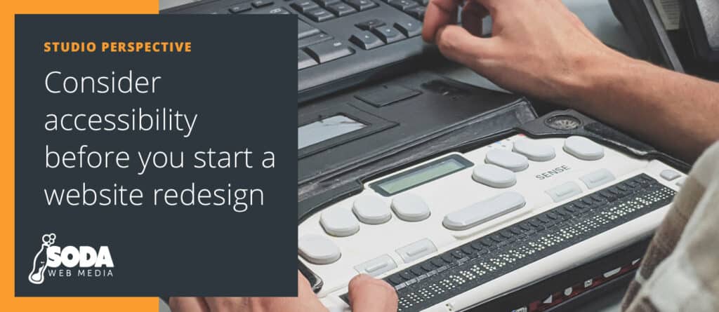
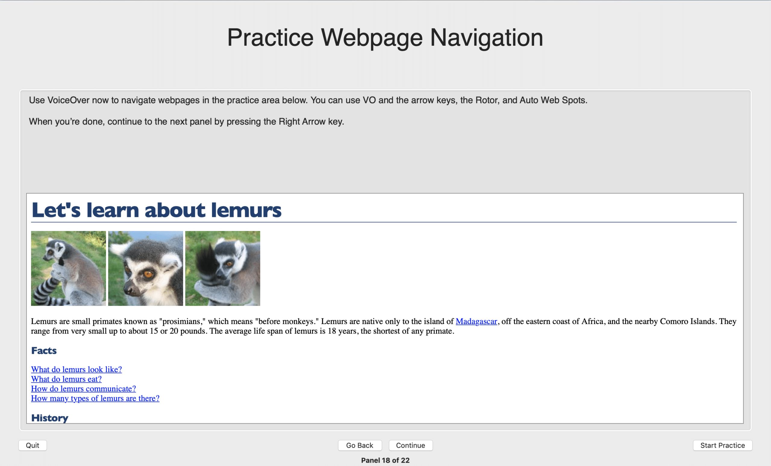
Gain first-hand experience with the tools that people with disabilities are using to navigate the internet. Try navigating your own website with assistive technologies such as VoiceOver on Mac (Free), JAWS Screen Reader on Windows (Paid), and NVDA Screen Reader on Windows (Free and Open Source). If you are on Linux, Orca Screen Reader is another free and open-source alternative.
-
Research good and bad accessibility practices.
Reading, reading and more reading. The truth is accessibility comes in many flavors with many opinions. In the end, the simpler, the better. A great resource to better understand accessibility is to read the technical specification guide WAI-ARIA for internet web and apps published by World Wide Consortium. I also found the Web Content Accessibility Guidelines (WCAG), MDN, and Google’s Web Fundamentals Accessibility are very helpful resources. Those resources should be read by both designers and developers.
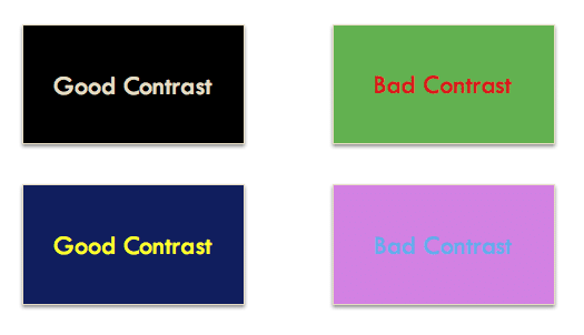
Image Source webcourses.ucf.edu Understanding the difference between good and bad accessibility will give you an idea of how you can improve. Start small, read, talk with your team and apply the changes. Don’t rush the process, accessibility requires a different mentality and if you rush, your team might get upset.
-
Always look for ways to improve your team.
Accessibility is a skill and a mindset. It is slow, incremental and at times frustrating; no one is good at it. There will be a lot of debates and questions but it is important to keep up and always try to improve.
Sign up for an accessibility newsletter, follow accessibility leaders on twitter, and check out companies that publish content about those kinds of problems, like Deque Systems or Google Accessibility.
You can also partner with a couple of employees who are interested in learning more about accessibility and make them accessibility ambassadors. Help them lead and foster an accessible culture in your organization.
Follow those 3 steps to help yourself feel less overwhelmed when learning about accessibility.
- Gain Empathy – Try putting yourself in your user’s shoes and surf the internet with an assistive technology that is included in your device.
- Start Small – Learn how to use headings (h1, h2…) properly, learn about ARIA landmarks, add labels to your forms, keep color contrast in mind and use a proper ALT text for your images.
- Practice – Accessibility is a skill that you need to practice to become better.
What were your first steps in learning accessibility and how did you implement them in your company?


